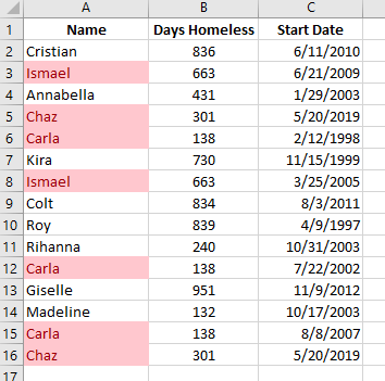
So you’ve just downloaded the latest homeless data to dive into. Immediately, you noticed that there are a few duplicate entries in your report. So now you wonder, “how many other duplicates are there?”
One simple Excel function is available to help you answer that question.
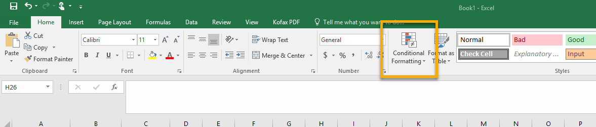
Conditional Formatting is a powerful tool that can help you visually explore and analyze your data.
You can find this nifty tool under the Home ribbon, in the Styles section:
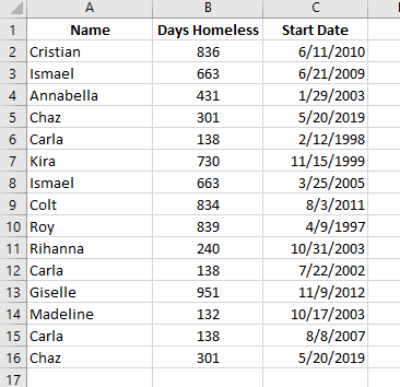
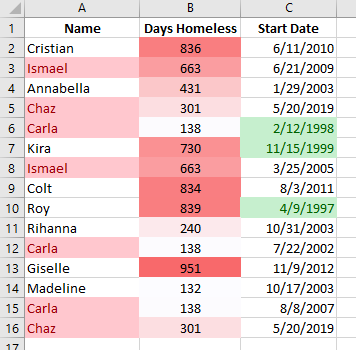
To illustrate, here we have a fictitious dataset of 15 clients, or so we think:
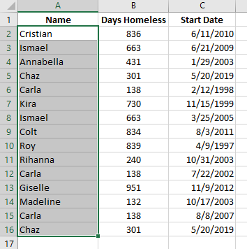
Highlighting Duplicates
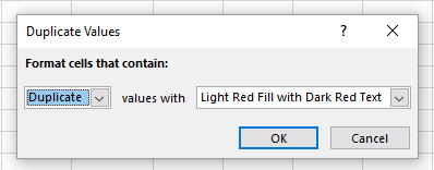
To check if there are any duplicate names, you can do the following:
- Highlight the Name column.
- Click on Conditional Formatting and navigate to Highlight Cells Rules > Duplicate Values…
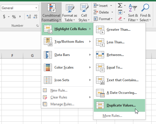
- Select the highlight color of your choice and click OK.
- Any duplicates is now highlighted in the Name column.
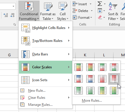
Color Scaling
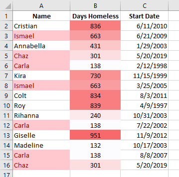
You can also create a color scale based on how large or small a measure is. In this same example, let’s take a look at the Days Homeless column.
- Highlight the Days Homeless
- Click on Conditional Formatting, then navigate to Color Scales.
- Select the red decreasing gradient icon in the middle row, all the way on the right.
- This will now highlight Days Homeless with the largest number as the darkest red and the lowest number as white.
You can play around with the different color scales depending on what measure you are analyzing.
Conditional Formatting with Simple Formulas
Finally, let’s do some conditional formatting with simple custom formulas. For this example, we would like to answer the question: Who has a Start Date before the year 2000?
- Highlight the Start Date
- Select Conditional Formatting and navigate to Highlight Cells Rules > Less Than…
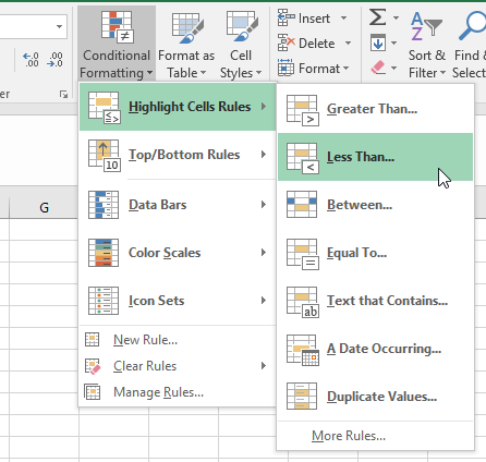
- Enter “1/1/2000” in the first box and select your desired highlight color.
- Click OK.
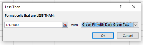
- The Start Date column has the three start dates that occur before the year 2000 highlighted.
And that’s it!
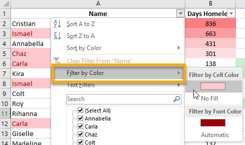
You can use this in conjunction with the previous Excel tip to filter your data to a specific color by simply using the Filter by Color option:
Now you are ready to trim down those spreadsheets and start getting to the heart of your data.
Remember, if you need assistance or have questions about reporting you can always contact your HMIS Team at Commerce.