Quick analysis tools in Excel
Excel provides a way to quickly create visualizations and analyze your data in just a few clicks. You don’t have to be an Excel wizard to have tailor-made insights at your fingertips.
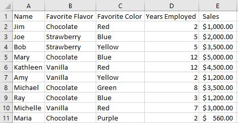
Here there is a sample set of data to use:
Let’s say you have been tasked with identifying how much of each flavor ice cream needed for an office party so you need to find out which flavor is most popular. In this sample set it would be easy enough to hand count, but imagine if you were doing things for hundreds or even thousands of records. That is a lot of counting (and a lot of ice cream). We are going to find our counts using a bar graph from the quick analysis tools in Excel.
First, highlight the data set you want to analyze. In this case, we want to highlight the “Favorite Flavor” column to get what we’re looking for.
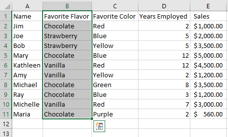
Notice that to the bottom right of our highlighted area there is a button that looks like a chart with a lightning bolt. This is the quick analysis button and we are going to click on it to open the menu.
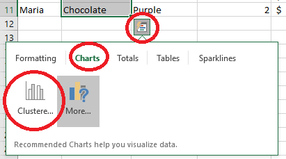
Now you can see that when the button is clicked it brings up a menu of different options. Feel free to play around with these other functions, but for our ice cream task we want to use the charts. Notice that Excel has made a suggestions for a clustered bar graph for me based on the highlighted data. We could also select “More…” to view other chart options.
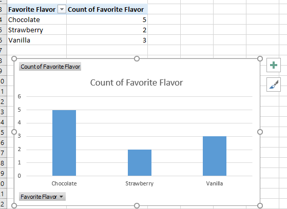
Clicking on the bar graph option populated a new sheet with a pivot table and graph. Now it is easy to see that we are going to need to order plenty of chocolate ice cream for the party.
Counting ice cream flavors is simple, but what if you want to go a little deeper? Our next assigned task is to see if there is a relationship between the years of employment at our imaginary company everyone has, and their sales. To do this, we will highlight both the “Years Employed” and “Sales” columns and open up quick access.
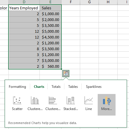
Note that the chart recommendations have changed. You can hover over each of the recommended options to see a preview of the chart it will output. For this task, we are going to use a scatter plot.
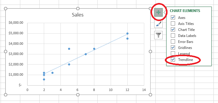
Now it is plain to see that the longer people have been employed, the more sales they make. We’ve also added in a trend line from the chart elements menu to help visualize the relationship better.
There is a lot of functionality in the quick analysis tool. Just highlight your data set and click the button (or hit CTRL+Q). The menus have lots of explanations for each chart type available to you and how to use it. Hopefully this is something you all can find uses for in your day-to-day work. Enjoy!
Remember, if you need assistance or have questions about reporting you can always contact your HMIS Team at Commerce.