Pivot Tables in Excel
Sometimes spreadsheets can be massive. When approaching a large set of data, arrayed across seemingly endless rows and columns, set in a tiny font that makes you question your optometrist, it can be hard to see how anyone could pull anything meaningful out. Pivot Tables are here to solve that problem.
What is a Pivot Table?
“A pivot table is a table of statistics that summarizes the data of a more extensive table. This summary might include sums, averages, or other statistics, which the pivot table groups together in a meaningful way.” –Wikipedia
How do I create a Pivot Table?
Select the data you want to analyze by highlighting it in your spreadsheet.
Once you’ve selected the data, go to the “Insert” tab on the ribbon and click on “Pivot Table”.
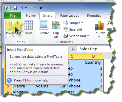
You’ll see a popup verifying your data set. You will also be able to choose where you want the Pivot Table to show up.
Once you click “OK” you’ll be taken to your Pivot Table. The Pivot Table starts as a blank page with the fields from your data set on the right side of the page. These are the choices of fields to display.
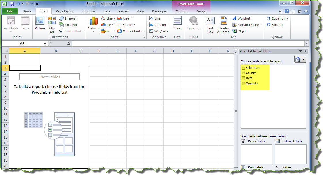
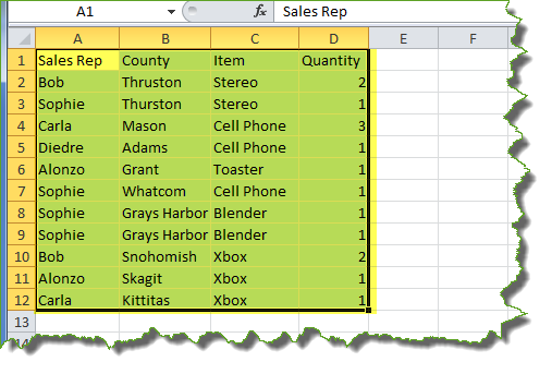
Use those fields to customize the data, so that you get the information you want. For example, our data set contains the following types of information:
- Sales Rep
- County
- Item
- Quantity
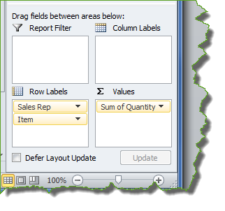
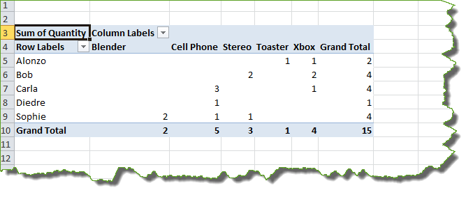
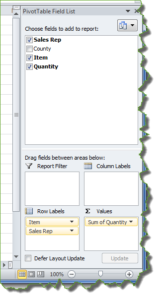
Using the field list, we can choose to view any or all of these items. In this example, we’re going to choose everything but “County”. As we click the field choices, they automatically show up in the table.
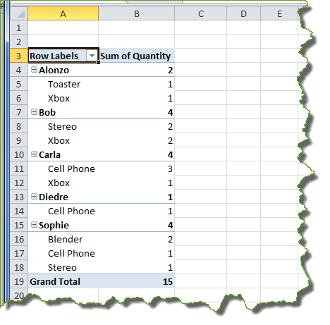
As you can see, Excel tries to guess how we want the information displayed. It’s giving us “Sales Rep” as our top level because we selected it first. “Item” is the next level down, which was selected second. “Quantity” is shown as a value because the all of the fields in “Quantity” are numeric.
If we want to change this, we can manipulate the view by dragging and dropping my fields into the display choices on the bottom right of the screen.
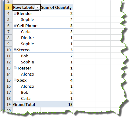
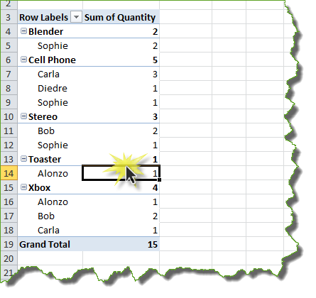
If we wanted to see “Item” at the top level and “Sales Rep” as the second level, then we could drag “Item” up.
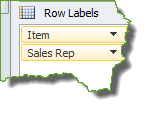
This changes our table to group first by “Item” and next by “Sales Rep”.
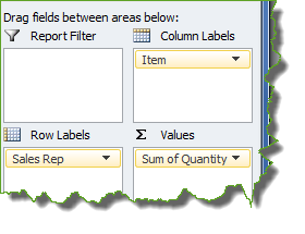
If we wanted to see the “Item” fields in columns instead of rows, we would drag “Item” to “Column Labels”.
Here’s how the table changes.
Pivot Tables also let you set up a filtering mechanism. Let’s say we want to be able to filter my data set by county. To do that we need to first select “County”.
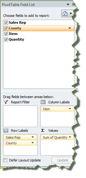
It automatically defaults to “Row Labels”. In order to make it my filter, I need to drag it to “Report Filter”.
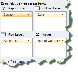
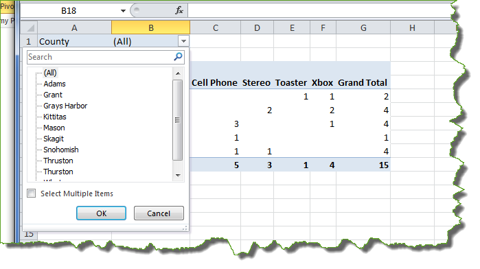
Now we have the ability to filter by “County” from the top of my report. We can even choose multiple counties if we click the check box allowing us to do so.
How do I change my Pivot Table?
Making adjustments to your Pivot Table is easy. Simply use the tools on the right side of your screen.
To drop a field, uncheck it. To move it, drag it to another area.
Sometimes you might not see your tools, though. If the Pivot Table tools are missing, you can always get them back by clicking in the area of the table itself.
How do I change the way “Values” show up?
The “Values” section defaults to “sum”.
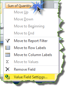
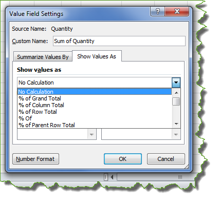
If you want to see a different value, you can change this by clicking on the dropdown arrow next to the field label. From there, click on “Value Field Settings…”.
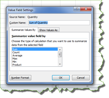
From here you will have the ability to choose how you want the data summarized. You can also customize the name.
If you prefer, you can use a “Show Values As” option to view percentages.
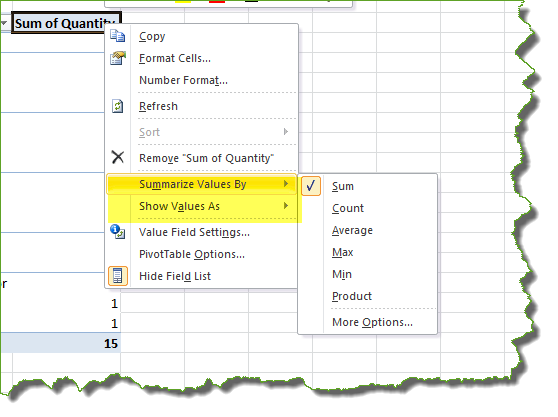
You can also change the way you see values by right clicking on a column heading. This allows you to determine how you want your values summarized or shown.
How do I quickly drill down for more information in a Pivot Table?
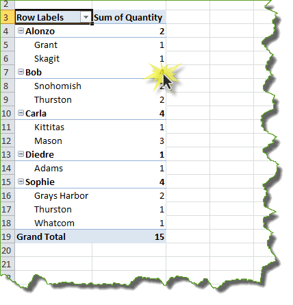
If you want more information about a number in your pivot table, you can drill down instantly by double clicking on the number. For example, if we wanted details for all four of Bob’s sales we would double click on the number four.
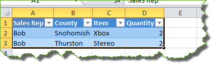
Depending on what you ask for, either a new sheet will open with the details as seen below or the information will show up in your existing table.
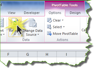
How do I make sure my pivot table is up to date?
Sometimes you may need to add information to the spreadsheet that populates your pivot table. To refresh your pivot table so it gives you the most up to date information, go to your pivot table tools, click “Options” and then click on the “Refresh” button. (You can do this using Alt-F5 as a shortcut, as well.)
How do I use grouping to analyze my data?
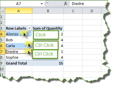
Now that you can create a basic table, you might want to be able to analyze your information by putting it into groups that make sense to you. For example, let’s say the sales reps in our earlier example work in two different regions. We’d like to be able to compare the quantity of sales between the two regions. In order to do this, we’d use a manual grouping function.
The first thing you need to do is determine your groups. In my example, Alonzo, Carla and Deidre are in Region 1 and Bob and Sophie are in Region 2. To select the group, click on the first member of your group, then hold down ‘Ctrl’ and click on the other members.
Next right click on one of your group members. Now group them.
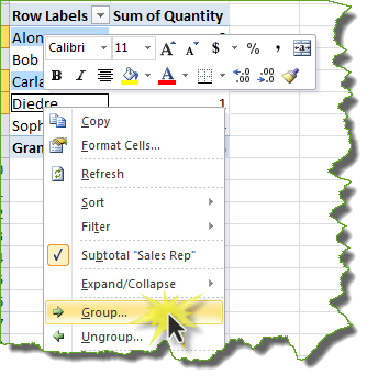
Group 1 is now set up. Using the same method, create your second group.
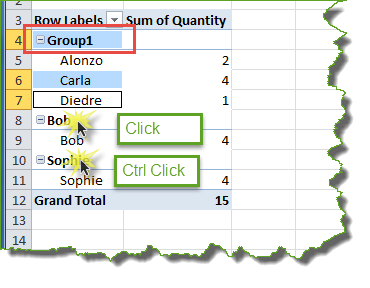
The sales reps are now grouped by region. You can rename the regions by clicking in the name field and typing whatever you want.
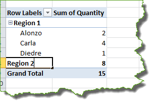
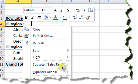
This doesn’t help analyze the date, though. In order to compare the two regions, you may want to see the “Sum of Quantity” for each grouping. To do this, right click on your group title and click “Subtotal”.
Even if you just use this option for one of the groups, it will allow you to see the subtotals for the other groups.

Once you’re done analyzing your data, you can ungroup by right clicking again and selecting “Ungroup”.
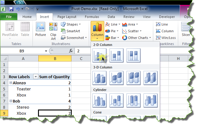
How do I turn my pivot table into a chart?
Once you’ve created your pivot table, you can make it into a chart by clicking within the table, clicking “Insert” and choosing the type of chart you want.
You can also create a chart when you first set up your pivot table by clicking on PivotChart when you first create the table instead of PivotTable. This will create both the table and a chart for you.
That’s everything you need to know to get started with pivot tables. Hopefully this tool will help you gain some insight into your data. Try running a couple of reports and turn them into pivot tables. You might find out something about your data that you hadn’t noticed before!
Remember, if you need assistance or have questions about reporting you can always contact your HMIS Team at Commerce.